

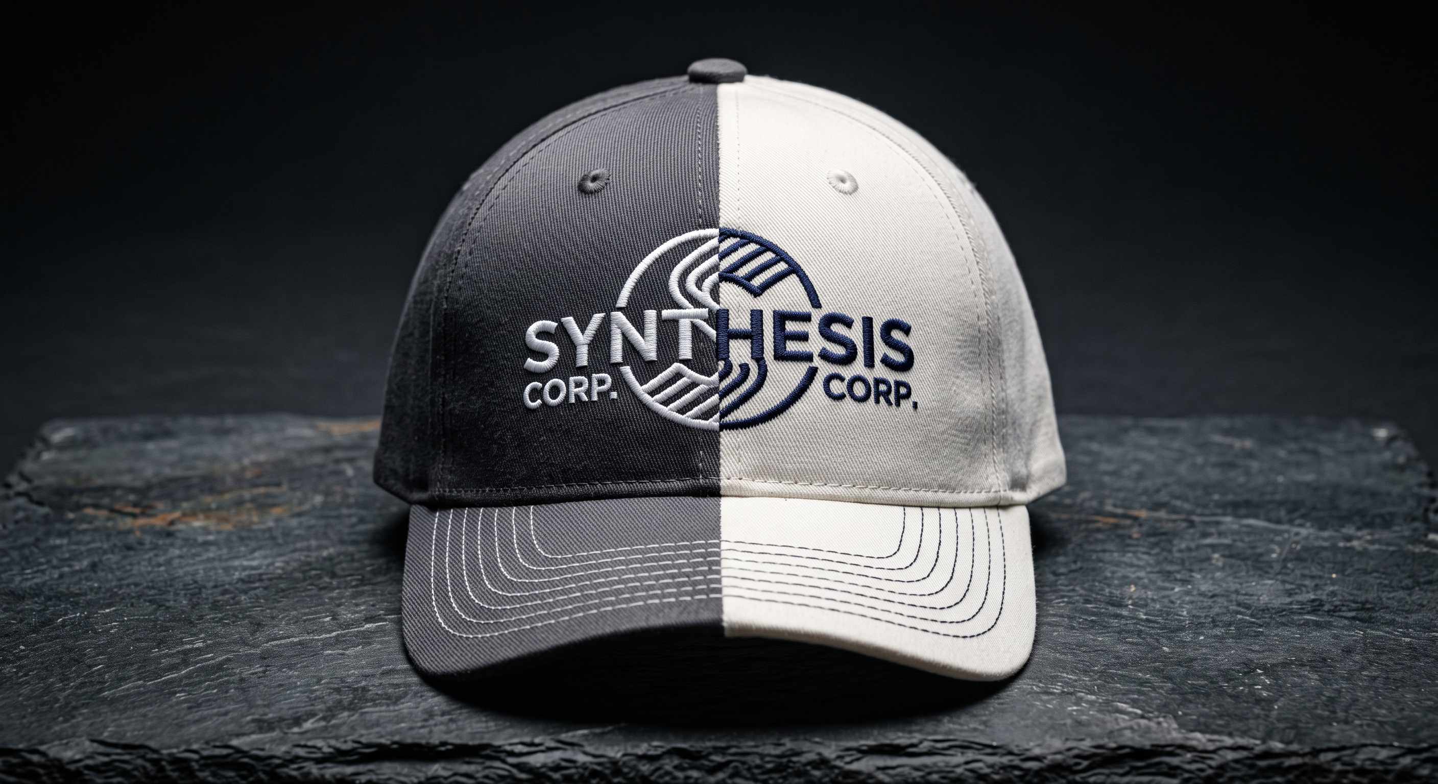
Key Takeaways
- Black, navy, charcoal, and white go with almost everything, worn plain or under a logo.
- Build around your logo's main color: keep it visible, or blend the thread into the hat on purpose.
- Avoid accidental pairings: green and red, rival team colors, red-white-blue.
- With no minimum, order one hat in each finalist color and compare them in hand.
Table of Contents
- What Color Hat Goes with Everything?
- How to Match a Hat Color to Your Logo
- Hat Color Combinations That Misfire
- What Are the Most Popular Custom Hat Colors?
- How to Check the Match Before You Order
- How to Test Several Hat Colors in One Order
- Frequently Asked Questions
- Pick Your Hat Color
Black, navy, charcoal, and white are the hat colors that go with everything, and khaki is close behind. That answers the question for a hat you wear with your own clothes. A hat that carries a logo is a different problem, because the logo's colors are fixed and the hat has to be chosen around them.
What Color Hat Goes with Everything?
Black, navy, charcoal, and white go with almost everything because they don't compete with any other color. Put one next to red, teal, or mustard and the hat stays in the background. Cap wearers know this from the other side. One menswear forum thread, about a green hat with a bright red logo, settled on this: dress in neutrals and let the cap be loud.
A hat with a logo on it works the same way. On black, navy, or charcoal, a white or yellow logo shows up clearly. On white, a dark logo does. Khaki and olive hold most logo colors as well, and they feel warmer and more outdoorsy than gray.
| Hat color | Logo colors that show up well | Watch for |
|---|---|---|
| Black | White, silver, gold, red, bright colors | Navy and dark green logos vanish at a distance |
| Navy | White, gold, red, light blue, khaki | Black and royal blue logos lose their edge |
| Charcoal or heather gray | White, black, red, navy, orange | Silver and mid-gray logos go flat |
| White | Black, navy, red, forest green, any dark color | Shows wear and sweat lines; pale logos disappear |
| Khaki | Black, dark brown, navy, forest green, maroon | Yellow and tan logos wash out |
White needs one honest note. It's the cleanest background for a dark logo, and it's also the first color to show wear, especially along the sweatband. Give a crew white hats and they'll look tired by the end of the season. For hats that come out for events, white is fine.
If you have a logo ready, you can browse custom hats and put it on any of these colors while you read.
How to Match a Hat Color to Your Logo
Start from the logo, because it's the one thing you can't change. Three steps get you from a logo file to a hat color that holds it.
1. Name the main color. Most logos have one color that carries the brand and one or two that support it. The main color is the one your customers would notice if it changed. A red symbol with black text has a red main color; a navy company name with a gold line under it has navy.
2. Decide the hat's job. A hat for staff, an event, or a store shelf usually wants contrast, so the logo shows from across a room. A hat for a client gift, or for weekend wear, often wants a quieter build, with thread close to the hat color (a tonal build). When you're unsure, go with contrast; tonal works best with a bold, simple logo and is a choice to make on purpose.
3. Run the background test. Look at where your logo already lives: your website header, your business card, the sign on the door. Whatever color sits behind it there is the safest hat color, because the logo was designed for it. If that background is white, a white or khaki hat is the direct match, and a black or navy hat is the bolder version.
Two shortcuts come out of step 1. The first is the supporting color. A red-and-navy logo looks best on a navy hat with the logo in red and white, since the hat is one of your brand's colors.
Your one-color logo is the second shortcut. Most brands have a white or black version for exactly this situation. A white logo on a forest green or maroon hat keeps the brand color in the hat and the logo crisp.
Underneath all of this sits one rule: a hat close in lightness to your main color swallows it. A mid-blue logo on a navy hat looks fine on a screen and disappears at 20 feet. Pick a hat that is clearly lighter or clearly darker than the main color.
| Your logo's main color | Hat colors that hold it | Skip |
|---|---|---|
| Black or charcoal | White, khaki, heather gray, light stone | Black, unless you want a tonal build |
| White or cream | Black, navy, charcoal, forest green, maroon | White, light gray |
| Red or maroon | Black, white, khaki, navy | Red, orange, brown |
| Navy or royal blue | White, khaki, heather gray, light blue | Black, navy, purple |
| Forest or olive green | Khaki, white, black, stone | Red (see below), olive |
| Yellow, gold, or orange | Black, navy, charcoal, dark green | White, yellow, tan |
| Three or more colors | Black, white, khaki, or gray, whichever matches none of them; or switch to your one-color logo | Any hat that matches one of the logo's colors, since that color vanishes |
Hat Color Combinations That Misfire
Most bad hat color combinations are accidents. The logo was fine and the hat was fine, and together they said something nobody intended.
Green and red is the classic. A forest green hat with a red logo says Christmas from September to February, whatever the brand is. One commenter in that menswear thread had worked in manufacturing and said green and red was banned at their plant, because those pieces never sold. Landscaping companies and breweries hit this most often, since green is already in the logo, and the fix is a khaki or black hat.
Red, white, and blue together look patriotic, which is right for a July event and wrong for a law firm. Orange on black drifts toward Halloween and hazard signs, so it suits a roofing crew and looks odd on a bakery. Purple and gold, orange and blue, and crimson and cream are all somebody's college colors. In a college town, the wrong pairing dresses your staff in the rival's colors.
Two quieter misfires waste more hats than any of those.
The first is the same-lightness problem: navy on black, olive on khaki, where the logo is technically there and nobody can see it. If the logo has to stay on a hat close to its own color, a thin outline in a contrasting thread brings it back. The Design Studio adds outlines to text and shapes.
The second happens on two-tone truckers. A logo colored to match the mesh looks like part of the back of the hat, and the front panel turns into an unrelated block. Match the logo to the panel it sits on and let the mesh be the accent.
None of this bans a color. Green on green can be exactly the quiet build you want, as long as you chose it.
What Are the Most Popular Custom Hat Colors?
Black, navy, charcoal, white, and khaki are the custom hat colors you see most on job sites, behind bars, and at trade show booths. Olive is close behind for outdoor brands. We don't publish order counts by color, so treat this as a description of what dominates and why, not a ranking.
The reasons have nothing to do with fashion. These colors hold almost any logo. They hide wear, apart from white, so the hat still looks right after a season. And they go with whatever the wearer already owns, so a navy branded hat gets worn on days off and a purple one mostly doesn't.
The branded-hat classic built from these colors is the two-tone trucker: a black, navy, or charcoal front panel with white mesh behind it. The dark panel gives the logo something to sit on, and the white mesh keeps the whole hat from looking heavy. Flip it, a white front with a colored mesh, and you have the summer version, which takes a dark logo well.
Camo and other patterns are a different case. A busy background swallows thin lettering and mid-tone colors. A logo on camo wants either a solid, bright thread (white, orange, or old gold) or a patch with its own solid background. A leather or PVC patch on a camo trucker is a common build for exactly that reason.
A bright brand color is loudest on a neutral hat. Yellow on black gets spotted across a parking lot; yellow on yellow gets noticed up close.
How to Check the Match Before You Order
Griwolfe's Design Studio shows your logo on the actual hat, in the color you picked, before you order anything. Open the product page, choose the color, pick the placement and the customization method, and upload your logo. To compare a second color, select it on the product page and place the same logo again from your uploads. The file stays there while you're on the site, so you don't upload it twice.
The Design Studio also picks out the colors in your logo and lets you swap each one to a named thread color. If a color disappears against the hat in the preview, change it to one that shows. Which customization method reproduces your artwork, and how thread looks against different hat colors, is covered in how to put a logo on a hat.
Tonal and Contrast Thread Colors by Hat Color
The thread colors we stitch have names, and the names tell you how a pairing will look. These hold up on finished hats:
| Hat color | Tonal thread (quiet) | Contrast thread (stands out at a distance) |
|---|---|---|
| Black | Charcoal | White, Silver, Old Gold |
| Navy | Smoke Blue, Denim | White, Old Gold, Red |
| Charcoal | Silver | White, Black, Red |
| Khaki | Light Olive, Medium Brown | Black, Dark Walnut, Navy |
| Olive | Light Olive, Khaki | Old Gold, White |
| White | Silver | Black, Navy, Red |
A patch matches a Pantone reference exactly, while embroidery thread is matched to the closest color we stock. Put the Pantone code in the placement's note field and it carries through to the design proof. Printing and sublimated patches keep your logo's colors as they are, with no color limit. When exact color is the whole point, order custom patch hats.
You pick thread colors separately for each placement. That lets the front logo blend into the hat while a small side logo stands out, or the other way around.
How to Test Several Hat Colors in One Order
Order one hat in each finalist color and compare them in hand. Small brands on forums stitch out the same logo in several color versions and ask their followers which one looks clean before committing. With no minimum on any method, you can do the same with hat colors in one order: one black, one navy, one khaki, same design.
Because the design, method, size, and placement are the same, the three hats count together as one design group for volume pricing. The custom hat pricing guide explains how design groups work. A design proof arrives by email within 1 to 2 business days, with unlimited revisions before anything is produced.
Frequently Asked Questions
What color hat goes with a black logo?
White, khaki, and heather gray, because the logo stays clearly darker than the hat. Navy works if the logo is bold. A black logo on a black hat is a tonal build. It shows as texture up close and disappears at a distance, which suits a quiet gift better than a staff hat.
Which cap color is best for summer?
White, khaki, and light gray fronts run cooler in direct sun than black or navy. A white mesh back on a trucker lets heat out. The tradeoff is that light colors show sweat lines and dirt sooner. For a summer crew hat that has to look right all season, a navy front with white mesh is the usual compromise.
Which cap color looks best on brown skin?
Any of them. No hat color is off limits for brown skin, and deep tones such as navy, forest green, and maroon are easy picks. When the hat is for a whole team, you're choosing for many people at once. Let the logo set the color and stay with a neutral that suits everyone.
Can I see my logo on different hat colors before I order?
Yes. In Griwolfe's Design Studio, your logo shows on the actual hat in whichever color you select. To compare colors, select another one on the product page and place the same upload on it; nothing has to be sent twice. You can also order one hat in each color you're weighing and compare them in hand.
What is the best hat color for men?
Black, navy, or charcoal. They go with work clothes and weekend clothes alike and hide wear, which makes them the usual pick for an everyday cap. Khaki is the warmer alternative. If the cap carries a logo, let the logo's main color pick the hat, keeping the hat clearly lighter or darker than it.
Is a white hat a bad idea for a logo?
No. For a dark logo it's the cleanest background you can pick. A white or pale logo disappears on it, so white suits black, navy, red, and other dark logos. White does show wear and sweat lines faster than any other color, so it fits event and retail hats better than a daily crew hat.
Pick Your Hat Color
For a hat you wear with your own clothes, the color that goes with everything is black, navy, charcoal, or white. For a hat with your logo on it, start from the logo. Name its main color, decide whether the hat should be loud or quiet, and run the background test. Then check the pairing against the accidental ones: holiday colors, rival colors, and a hat too close in lightness to the logo.
The last step takes a minute: put the logo on the real hat in the Design Studio and try it on two or three colors. If it's still close, order one of each. No minimum, no setup fee, and a design proof to approve before we produce a single one. Browse the Custom Hats collection →
Have a question about your order? Contact us. We'll get back to you the same day.
Share:
Trucker Hat Embroidery: Front, Sides, Even the Mesh Back
Custom Hat Design Ideas: 14 Looks Sized to Fit the Hat